Choose Resume Fonts Wisely...
Resumes Shine With the Right Fonts
Use professional looking resume fonts on your resumes. This is not the time to get creative or artistic, in most cases (unless, of course, you ARE an artist or creative career type).

Fonts, fonts, and more fonts! Sometimes, your choices seem endless. If you have a word processing program and desktop publishing or greeting card software on your computer, you probably have more fonts than you know what to do with.

That's all well and good if you're designing a card or a poster, or perhaps even a business card.
So tempting, right? I know my daughter is always using some new font on every document she works on.
But when it comes to resumes, you should limit your choices to just a few of the most well-recognized and easy-to-read fonts in your collection.
Your goal is not to make your resume beautiful to your eyes... it's to make it extremely readable to the people doing the screening and hiring.
Make sense?
Recommended Resume Fonts
Rule of Thumb
Never use more than 2 fonts in a single document, including when you're writing a resume.
It's OK to use variations in bold, italic, and different sizes, but for best results stick with one font for your headings, and if you must use a second font, then use it on your actual content.
So, which resume fonts are best to use in resumes?
For our purposes, let's divide fonts into 2 main categories: serif fonts and sans-serif fonts.
Serif Fonts
Serif is just a word that translates to "tails" on the letters. For instance, Times New Roman, which is pictured below, a popular font in most word processing programs, is a serif font. See the tails on the ends of the bar across the top of the "T"?
![]()
Here are some more examples (with their names) of serif fonts appropriate for use in your resume.
 If you use these fonts for your headings, then use one of the sans-serif fonts described below for the rest of your resume.
It's nice to have that contrast of styles between the header resume fonts and the body resume fonts.
Also, you'll note in the sample at the left that the fonts appear to be different sizes. However, each one was the 20-point size.
So you may need to experiment a bit to get your resume fonts to look the way you want them to.

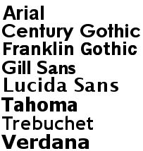
Sans Serif Fonts
Sans serif basically means "without (sans) the tails (serif)." These are fonts like the popular Arial, that are more blocky in appearance. On a printed document, the sans serif fonts make striking headers, while the serif fonts are nicer for the main content.
However, online, quite the opposite is true, so most websites you'll see (like this one) use a sans serif font in the text. Sans serif fonts tend to be easier to read on a computer screen, so they are the better choice for the bulk of your content online.
Here are some examples of appropriate sans serif resume fonts:
So make your choice of resume fonts wisely, depending on whether your resume will be printed on paper... or viewed online. Above all, be sure that your resume is always easy-to-read and professional in appearance, and you can't go wrong.
Learn More About Writing a Resume
- Start here to learn how to create a resume
- Get tips for effective resume writing
- Learn about the different resume formats you can use
- Should you use resume objectives or a power statement?
- Find out about resume layouts
- Why specific resume wording matters

If you have resume questions, Ask the Expert has answers...
- How to show your work history
- About listing your education (or lack of)
- Dos and don'ts of cover letters
Search This Site:
Welcome


Writing a Resume
 Getting Started
 Writing Tips
 Choose Format
 Objectives... or NOT
 Resume Layouts
 The Right Fonts
 Wording Tips
 Format Questions?
Resume Examples
 Power of Example
 Free Examples
 Chrono. Examples
 Functional Samples
 Combo Format
 Student Resumes
 Entry Level Samples
 Prof. Samples
- Executive Resumes
 By Job Types
Resume Templates
 Start Here
 Outline
 Chronological Format
 Functional Format
 Hybrid Format
 CV Templates
 MS Word Templates
Online Resumes


Cover Letter Advice
 Start Here
 What Is a Cover Ltr
 Cover Letter Do's
 Cover Letter Don'ts
 Step-by-Step
 What Format to Use
 Letter Templates
- Great Examples
 More Letter Tips
 Follow Up Letters
 Cover Ltr Questions?
Job Interview Tips


Find a Job


Career Change
 Start With a Plan
 Career Change
 Freelancing
 Start a Home Biz
- My Dream Career
- Work at Home Ideas
- Home Business Training
Get Help
 Peer Review
 Emp. Gap Questions
 Wk History Questions
 Employer Questions
 Education Questions
- Format Questions
- Cover Ltr Questions
 Interview Questions
- Career Change Questions
- Losing a Job
 Misc. Questions
Just for Fun


More Help
Site Sponsors
See our Advertising Policy
Advertise on this Site


Job Seekers'
Power Pack!

Grab your copy of these 5 concise reports about every aspect of the job hunt. Don't miss this opportunity to change your life for the better!


FREE Tips & Advice

Sign up to our newsletter, PSRF Career Connection and get free gifts!


